Interpreting the Design Philosophy of NIDA's New Logo
2025-06-04
Comentropy Industry and Standards Innovation Service Center was honored to assist the Network Innovation and Development Alliance (NIDA) last year in upgrading and designing its brand-new logo. The new logo is not merely a reshaping of visual language but a profound expression of the brand's core values and future strategic direction. Below is our detailed interpretation of this logo's design philosophy:
01 Continuing Brand DNA, Parallel Inheritance and Innovation
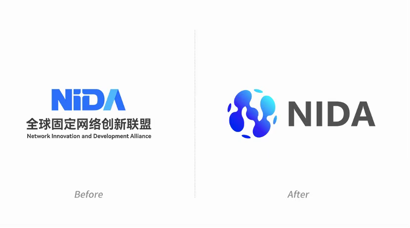
NIDA's original logo was based on its four letters, cleverly using positive and negative space to create the visual effect of a "beacon of technology" between the "i" and "D". This design carried the brand spirit of innovation and the future, while a cross shape metaphorically represented a close-up of network connections, conveying the brand concept of interconnection and high-speed broadband experience. In designing the new logo, we continued the essence of this brand DNA, ensuring its core concepts were inherited, and on this foundation, integrated more dynamic and open elements to align with the current rapidly developing industrial ecosystem and global market demands.
02 Organic Liquid Form: Symbol of Dynamism and Flexibility

The main design of the new logo adopts an organic, flowing liquid form. This design language not only symbolizes data fluidity but also reflects the dynamism of information transmission and the real-time nature of network connections. This sense of flow demonstrates the characteristic of networks freely traversing multi-dimensional spaces, and also implies NIDA's adaptability and flexibility in the face of a rapidly changing industry environment.
This concept, breaking through traditional linear design, not only showcases the dynamic interaction of data flows within the network but also reflects NIDA's leading position in the experience upgrade of the "Qualitatively-Enhanced Internet"—faster connections, smarter networks, stronger security, and broader application scenario coverage.
03 Globalization of the Network: Dots and Lines Constructing a 3D "N"

Another core design highlight of the new logo is the construction of a three-dimensional letter "N" on a spherical surface through the combination of dots and lines. This design not only directly embodies NIDA's brand identity but also visually conveys its open stance as a global international alliance.
The three-dimensional "N" structure conveys multiple meanings: an open organizational structure, the capability for standardized global industry promotion, and the flexibility to cover diverse scenarios. This design language holds profound meaning in its simplicity, presenting complex information through a concise graphic, making it easy to recognize and enhancing the brand's international image.
04 4 Key Points: Integration of Technology and Business

When designing the letter "N", we specifically integrated NIDA's core business—innovative exploration around the four major scenarios of "Connected Computing, Connected Intelligence, Connected Data, and Connected Space." These four key points run through the four major technical directions of the Qualitatively-Enhanced Internet:
- Ultra-Broadband New Connections: Faster network speeds and more stable connections.
- IPv6+ New Expansion: Promoting the upgrade and widespread application of network protocols.
- Network New Intelligence: Achieving efficient allocation and optimization of network resources through intelligent technology.
- New Security Mechanisms: Building a more advanced and reliable network security protection system.
By integrating these technical directions, we hope to reflect NIDA's future core path in the logo design and showcase its technological leadership and foresight in the Qualitatively-Enhanced Internet field.
05 Cooperation and Openness: Clever Integration of the "Hands Joining" Metaphor

In the design, we cleverly integrated the metaphorical element of hands joining, symbolizing NIDA as an open and cooperative international alliance, connecting global innovation forces to jointly advance network technology. This detail not only enriches the graphic's meaning but also adds a layer of humanistic care to the logo.
06 Blue Gradient: Visual Expression of Wisdom and Modernity
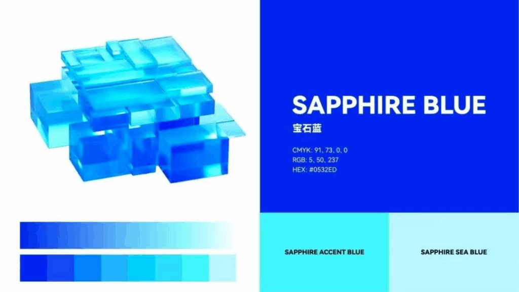
For the color selection, we chose a sapphire blue gradient, transitioning from deep blue to light blue. This conveys the core brand values of wisdom, trust, and stability, while also endowing the logo with a modern feel and vitality. Deep blue symbolizes professionalism and reliability, while light blue adds a touch of youthful innovation. This gradient treatment not only enhances the brand's visual impact but also strongly supports its modern and international image.
07 3D Feel Design: Metaphor for Higher-Dimensional Thinking
Although the new logo is a flat design, the combination of dots, lines, and flowing forms creates a strong sense of three-dimensionality. This design technique not only enhances visual impact but also metaphorically represents NIDA's higher-dimensional thinking in the field of Qualitatively-Enhanced Internet technology: from a single dimension to multiple dimensions, from local to holistic comprehensive innovation. This concept of "elevated-dimensional thinking" is a true reflection of NIDA's continuous boundary-pushing and future-leading role in the industry.
08 Conclusion: Design Empowering the Brand's Future
As the design agency, Comentropy Industry and Standards Innovation Service Center hopes this new logo will inject new vitality and depth into NIDA's brand. It is not just an update of a visual symbol but a condensed expression of the brand's core values and future vision.
With this new design, NIDA not only solidifies its core position in the global network innovation field but also conveys to the world its relentless pursuit of innovation, cooperation, and technological excellence. We firmly believe this logo will become an important milestone in NIDA's brand development, continuing to shine brightly on the future global stage.