Decoding the Logo of the Comentropy Service Center
2025-05-13
Although the logo of the Comentropy Industry and Standards Innovation Service Center received its trademark registration certificate back in 2022, its official interpretation has never been released on any platform. Recently, prompted by numerous inquiries and curiosity from industry professionals, we decided to take this opportunity to share the design philosophy and deeper meaning behind this logo.
As the core service platform of the Hetao International Organization Headquarters, the Comentropy Service Center is dedicated to offering comprehensive high - quality services to international industry and standards organizations. Whether in constructing a standardization ecosystem, delivering eight fundamental services including consulting, operations, and marketing, or setting up four crucial platforms such as AllianceHub, human resources management, finance, and compliance. The Comentropy Service Center is guided by the principles of "standards" and "order". The logo design aptly embodies this philosophy.

Four Interlocking Rings
The Core Values of "Passion, Vitality, Ecology, and Innovation"
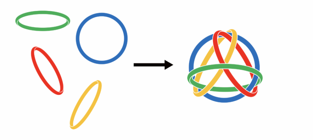
The main body of the logo consists of four vibrant rings in red, orange, green and blue. These rings are interlocked and closely connected. This is not only a visual expression of the core values of the Service Center, but also symbolizes the orderly coordination brought about by standardization. Each color is laden with profound meaning:
The Ring of Molten Flame (Red):
Symbolizing passion and energy, akin to a fiercely burning flame, it represents the proactive service attitude and unwavering dedication of the service center. Red embodies the center’s passion and mission for advancing standardization, driving the orderly development of global standards with sincerity.
The Ring of Rising Sun (Orange):
Representing vitality and hope, like the rising sun that is brimming with life, it reflects the flexibility and adaptability of the team. The vibrancy of the orange color symbolizes the future-oriented adaptability and inclusiveness of industrial standards, ensuring sustainable growth in the rapidly evolving global landscape.
The Ring of Verdant Forest (Green):
Symbolizing ecology and harmony, it conveys the service center’s commitment to fostering an open and shared ecological environment. Green signifies the openness and compatibility of the standards system, emphasizing the promotion of win-win cooperation within a diverse industrial ecosystem.
The Ring of Celestial Dome (Blue):
Representing innovation and the future, like the vast expanse of the sky, it indicats that the service center views innovation as the core driver of development. Blue underscores the forward-thinking nature of standardization work, promoting the standardization and internationalization of industrial rules through continuous innovation, thereby guiding future industrial development.
These four colors are not merely aesthetic choices; the interlocking design of the four rings symbolizes the “systematicness and coordination inherent in the standardization process.” Together, they convey the core values of “passion, vitality, ecology, and innovation,” while also reflecting the systemic principle of standardization—“independent yet complementary.”
Rotating Four Rings
A Symbol of Efficiency and Collaboration
The four rings are not static but appear to rotate dynamically, resembling rapidly spinning particles and conveying a sense of perpetual motion. This symbolizes the service center’s constant state of efficient operation, delivering high-quality services to clients with boundless energy.
The rotation of the four rings reflects the dynamic and continuously improving nature of standardization work. The formulation and implementation of standards are not static but evolve through ongoing collaboration and optimization, propelling industries toward greater efficiency and order.
Additionally, the four tightly interlocked and complementary rings symbolize the relationships between the communities and organizations served by the service center: independent yet interdependent, forming an inseparable whole. These relationships function like interlocking gears, growing and progressing together to create a better future.
Tetrahedron
A Symbol of Stability and Reliability

The intersection points of the four rings form an invisible tetrahedron—one of the most stable structures in geometry. This design cleverly conveys the service center’s professional and pragmatic approach, as well as its commitment to providing stable and reliable services to clients.
The stability of the tetrahedron symbolizes the foundational role of standardization work. Standards provide clear rules and frameworks for industries, enabling them to advance steadily within an orderly environment.
We believe that regardless of how the industry environment evolves, professional expertise, solid skills, and a pragmatic attitude will remain the enduring cornerstones of the service center.
Whitespace at the Center of the Logo
An Open and Inclusive Attitude
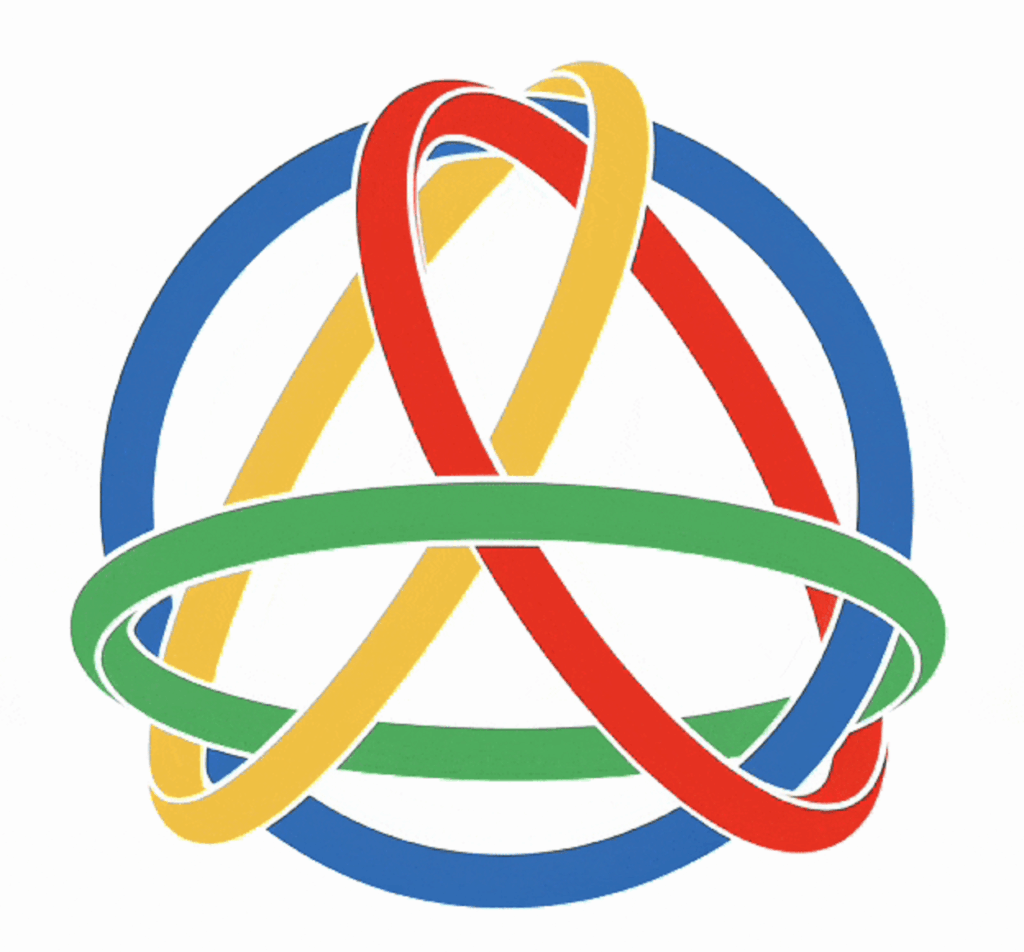
The logo features extensive whitespace at its center, which is not merely a design choice but a profound expression of the service center’s spirit. The whitespace symbolizes an open posture and a mindset of humility and openness.
留白象征着标准体系的开放性,强调在标准制定与推广过程中,始终保持包容的态度,欢迎各方提出建议,携手完善规则,共同探索未来的无限可能。在开放的产业生态中,服务中心愿意以谦逊和包容的态度,与客户、伙伴共同探索未来的无限可能。
Summary: The Beauty of Design
Details Rich in Meaning
The logo of the Comentropy Industry and Standards Innovation Service Center is far more than a simple graphic; it is a visual representation of the service center’s values. From passion, vitality, ecology, and innovation to efficient collaboration, stability, reliability, and openness, every design element carries deep significance.
More importantly, the logo—with its four interlocking rings and harmonious order—perfectly aligns with the service center’s mission: to build a more open, orderly, and sustainable industrial ecosystem through the advancement of standardization.
It not only communicates the service center’s mission and vision but also inspires every partner to join hands with us on the journey ahead, working together to create a brighter future.
This is more than just a logo—it is a symbol of belief, an embodiment of attitude, and the seamless integration of the spirit of standardization and industrial innovation. Through this interpretation, we hope you gain a deeper understanding of the spirit and aspirations of the Comentropy Service Center.